Roskosh is a fashion brand focusing on hair accessories – scrunchies, but it’s also a dream come true for its creator.
Roskosh supports women by emphasizing their femininity with unique designs. The brand was born out of the need for sense of community, the experience of spending time in a company of women, the atmosphere and girl-to-girl talks.
Roskosh is a tribute to femininity and celebrating of little pleasures.
My role
- Brand Identity System
- Logo Design
- Packaging Design
- Brand Strategy
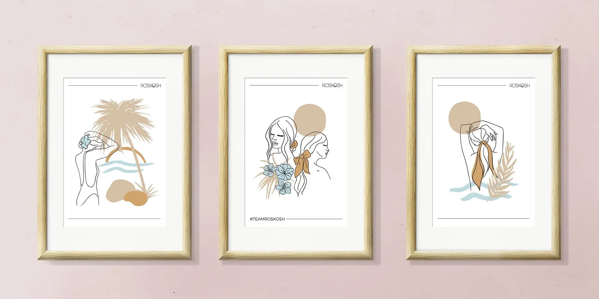
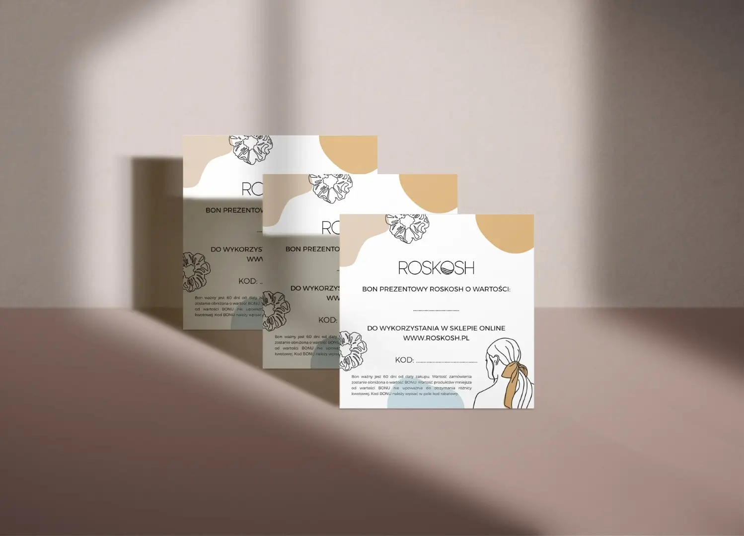
- Custom Icons & Illustrations
- Newsletter Template Design
- Social Media Graphics Design
- Stationery Design
Toolset
- Adobe Illustrator
- Adobe Photoshop
- Freshmail
Client
Roskosh
Completed
2019
Challenge
Solutions
Translated company vision into a unique logo, identity system and visual strategy that is consistent, reflects brand values and appeals to the right audience. Explored and presented possible expansion into different products in the future ensuring that systems can be implemented and used in the long term.
Brand Attributes
Throughout a number of brand consultations, we discovered and compiled a list of brand attributes which then served as a style compass while designing the logo and collateral assets.
- universal
- subtle
- happy
- empathetic
- relaxed
- brave
- light
- pleasant
- feminine
- natural
- unique
- free-spirited
Stylescape

Logo

Rationale
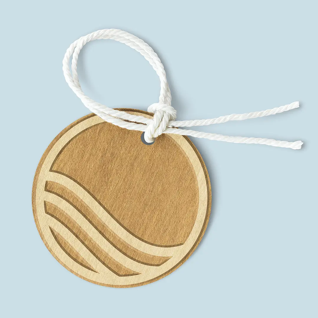
Logo is inspired by the shape of waves, sand dunes and hair flowing in the wind. It symbolizes the relaxing moment at the beach, the time spent playing with sand and drawing patterns with the fingers. Typography suggests subtle and light character of the brand and allows design to breathe. Sans serif typeface was selected to emphasize universal, inclusive nature of brand products.
Simplicity of the typeface in combination with custom symbol represents brand philosophy and mission to help women express their personality at any moment of their life via unique, distinctive hair accessories regardless of time or occasion.

Main logo & Submark
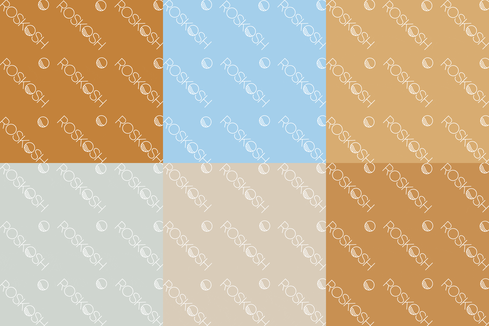
Main logo design is primarily used on website, printed materials, embroidered tag etc. while submark version of the logo is meant to be used as a profile picture on social media and other applications with limited space or for example as a website favicon.
Color palette
Brand colors have been inspired by the sea and sand colors, bringing the warmth, freedom and relaxing atmosphere of a peaceful day at the beach on a sunny day.
Zero-waste tags
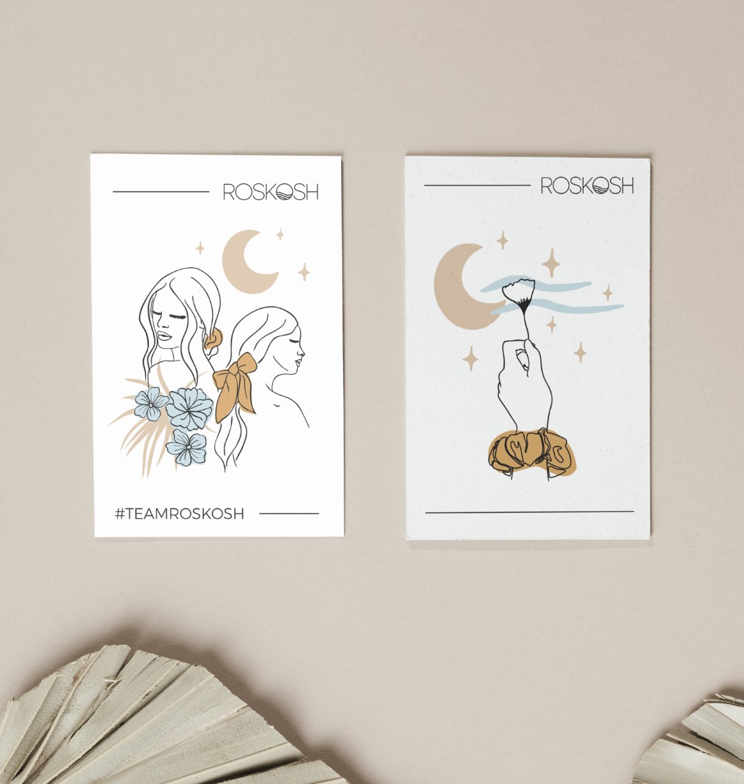
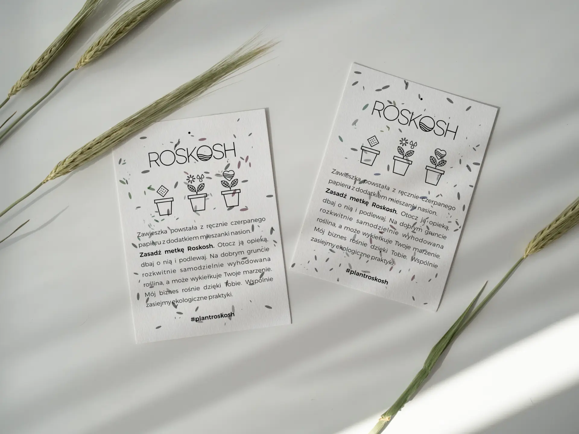
Printed on handmade paper containing seeds and meant to be sown, taken care of, and grown into a new plant.
They’re promoting zero-waste lifestyle that lies at the core of the brand, but also are a symbol of dreams coming true.
Packaging
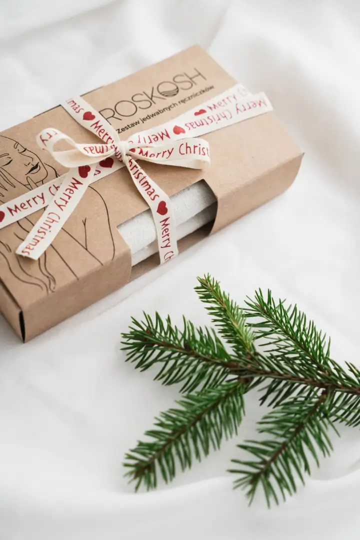
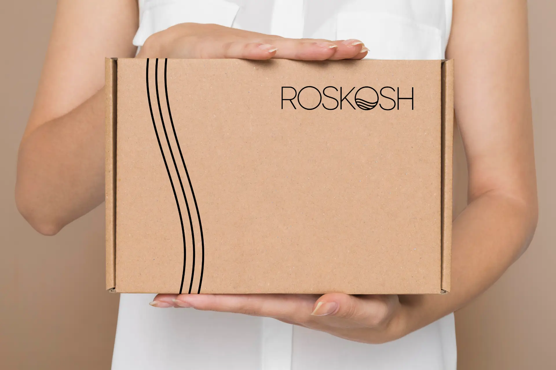
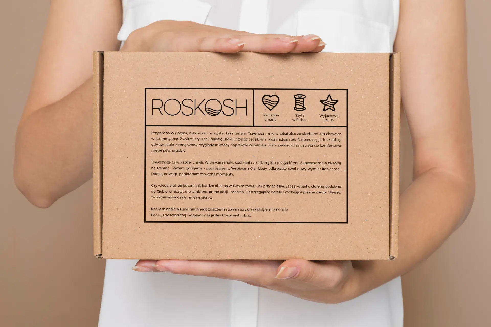
Kraft cardboard boxes made from 90% recycled content and water-based ink are used to make environmentally friendly packaging.
Minimalist design was created to emphasize brand’s message and to reduce the carbon footprint.
Reusable bag
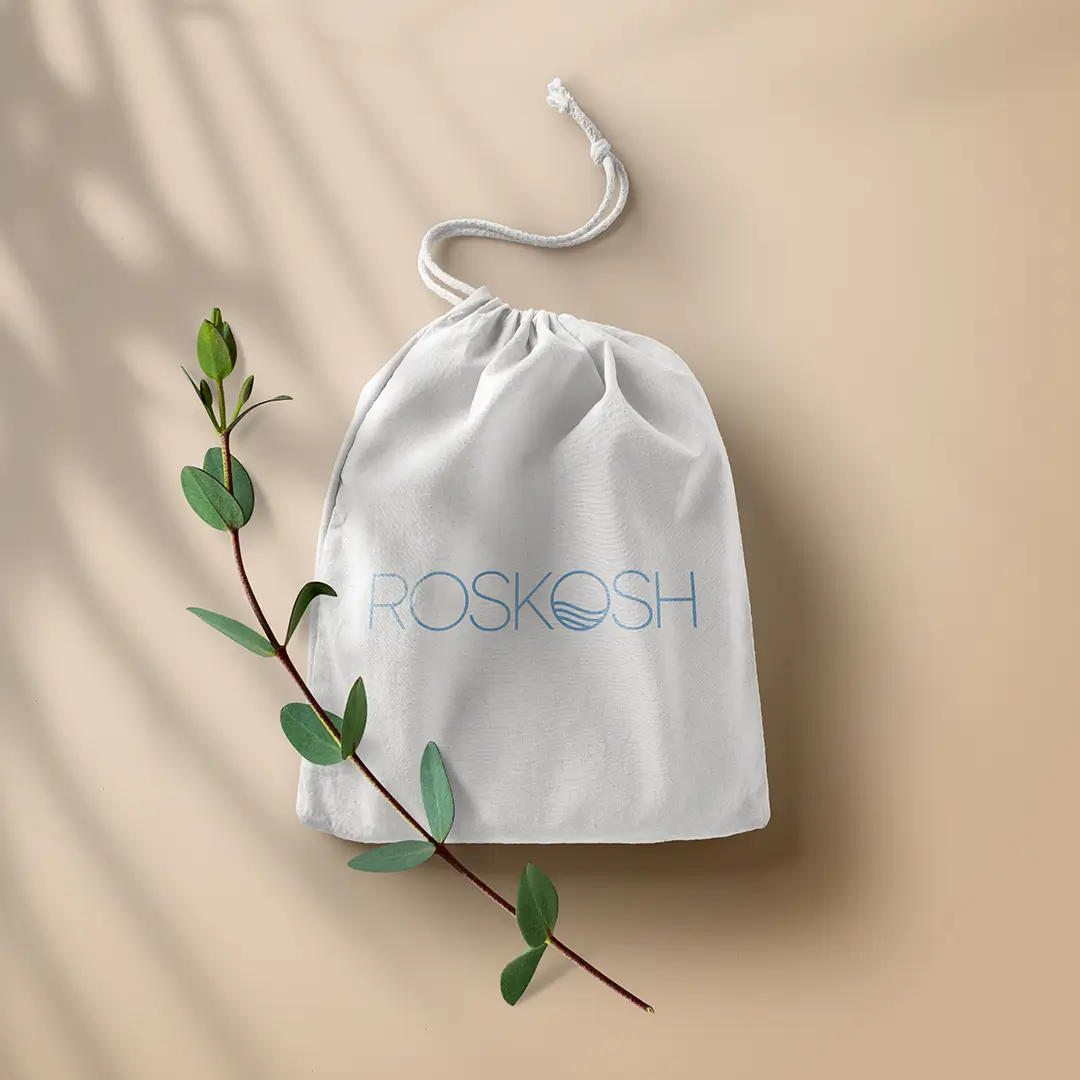
A 100% linen drawstring bag was created for storage and protection of the products and as a way for Roskosh to accompany women at every moment of their life.
Greeting cards
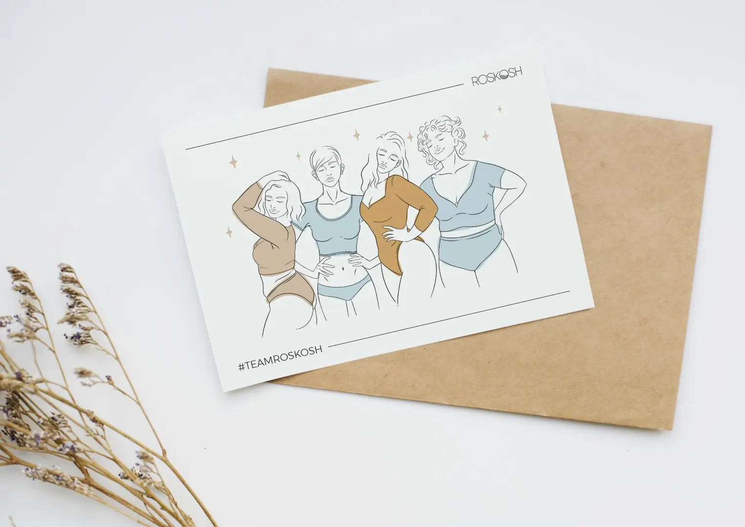
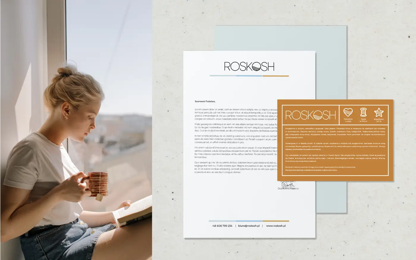
Stationery
