Zoddy is an app supporting creative problem solving process.
An application combining the power of AI and human expertise to enhance the creative process by recommending the most suitable tools to utilize during each stage of a project.
My role
- Information Architecture
- Application Workflow
- User journey
- UX/UI Workshops
- Wireframing
- Prototyping
- UX/UI Design
- Project Management
- User Testing
Toolset
- Miro
- Adobe XD
- Google Workspace
Client
SWPS University
Completed
1st phase: 2021
2nd phase: 2022
Goals: Phase I
- Creating an accurate demonstration of performance and potential of the app in the form of a functional demo with the goal of attracting future investors
- Creating a tool to support generation innovations and planning their implementation in organizations.
Goals: Phase II
- Running a series of usability tests to determine first impressions, discover areas requiring improvement and to gauge the interest of the potential audience.
- Optimizing UX and UI to ensure the application responds to needs of the user and provides a smooth, friendly experience.
The process: Phase I
Analysis & Strategy
Conducted a kick-off meeting to get the ball rolling and then ran a series of remote workshops in order to define app functional requirements, create User Profiles and work together to explore possibilities regarding the interface and interactions.
User Experience
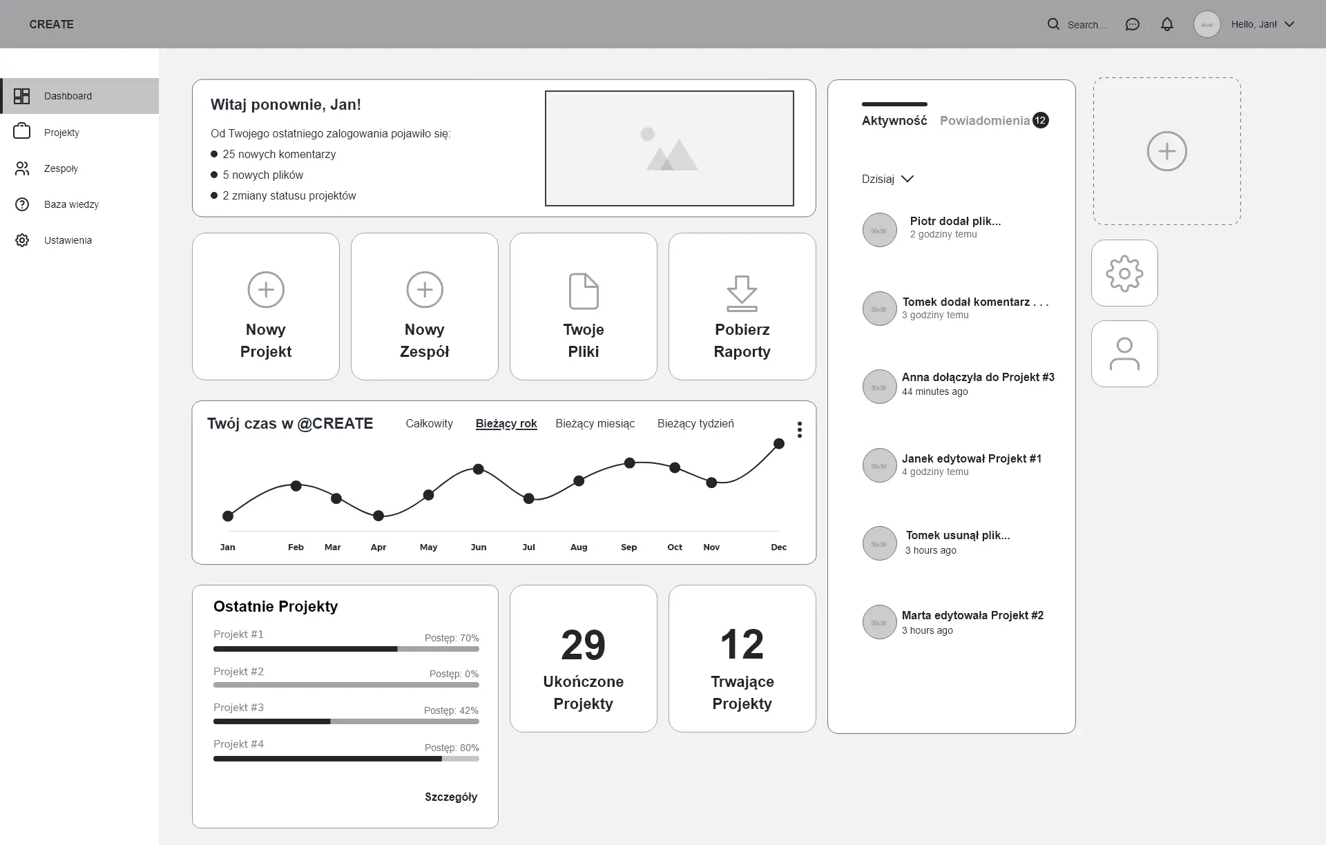
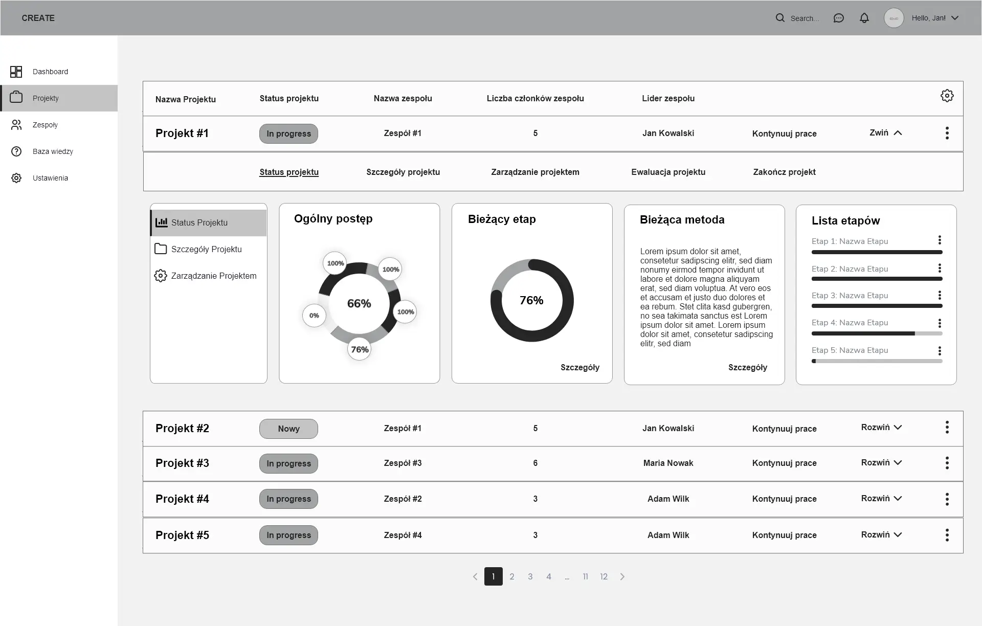
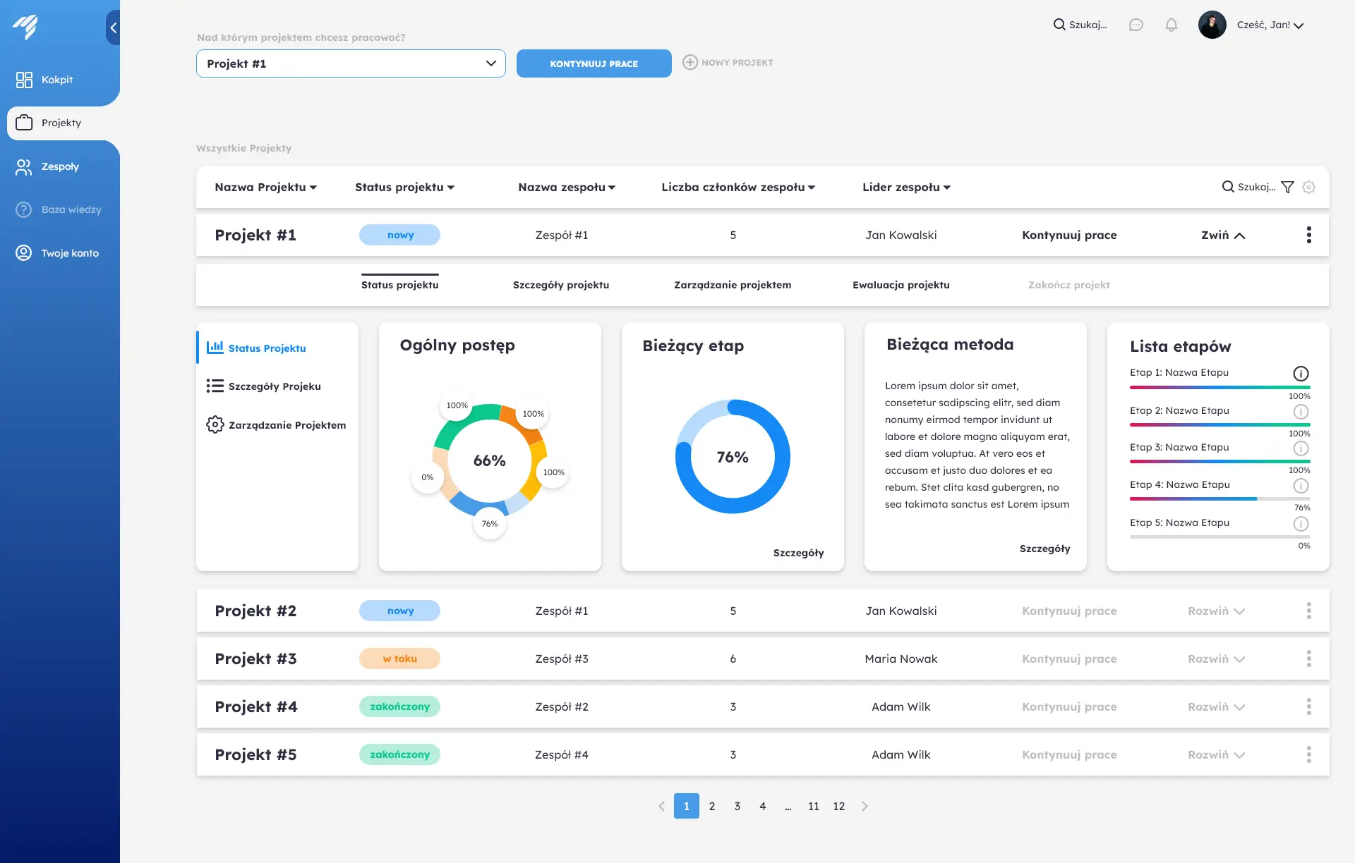
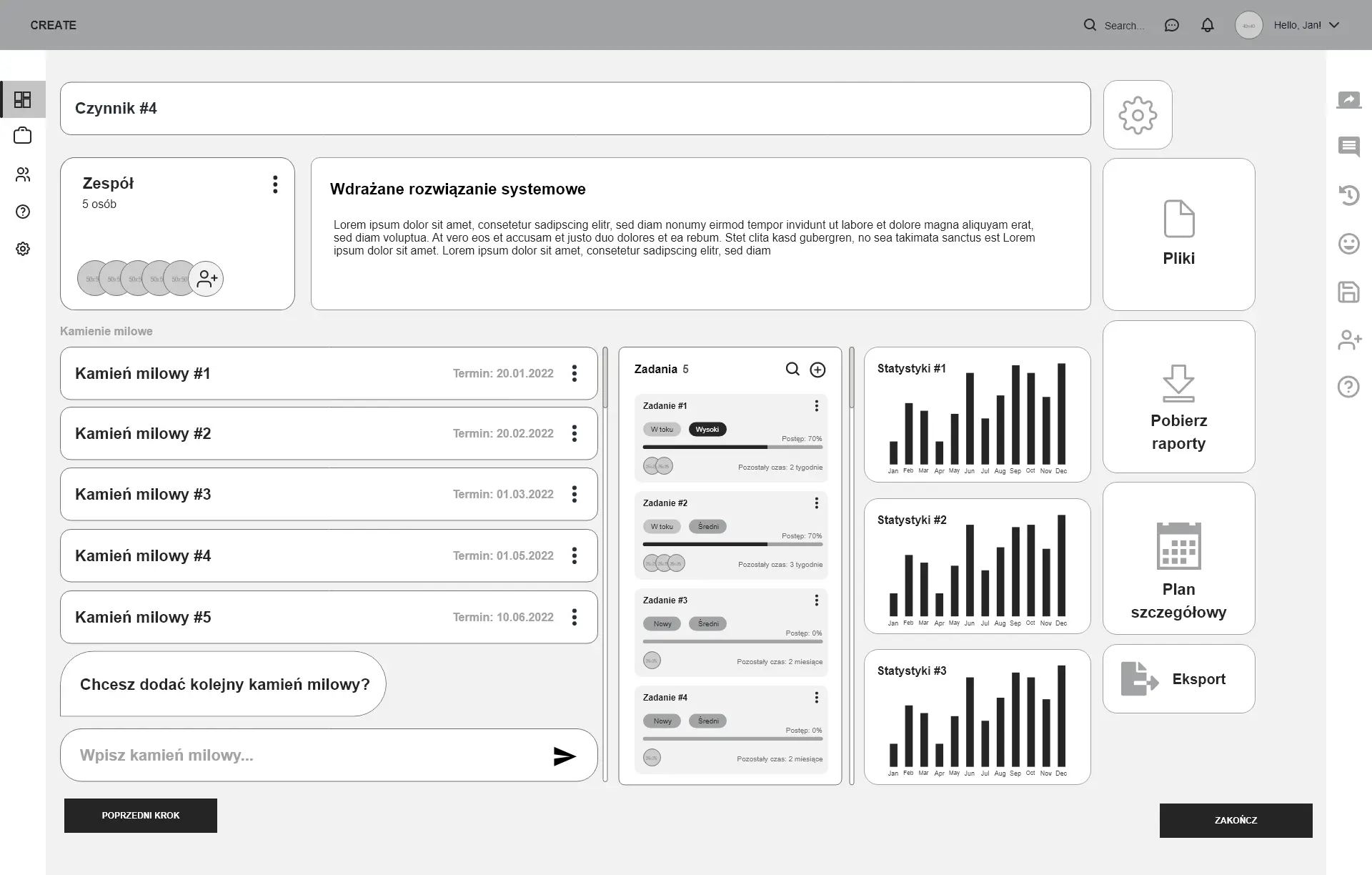
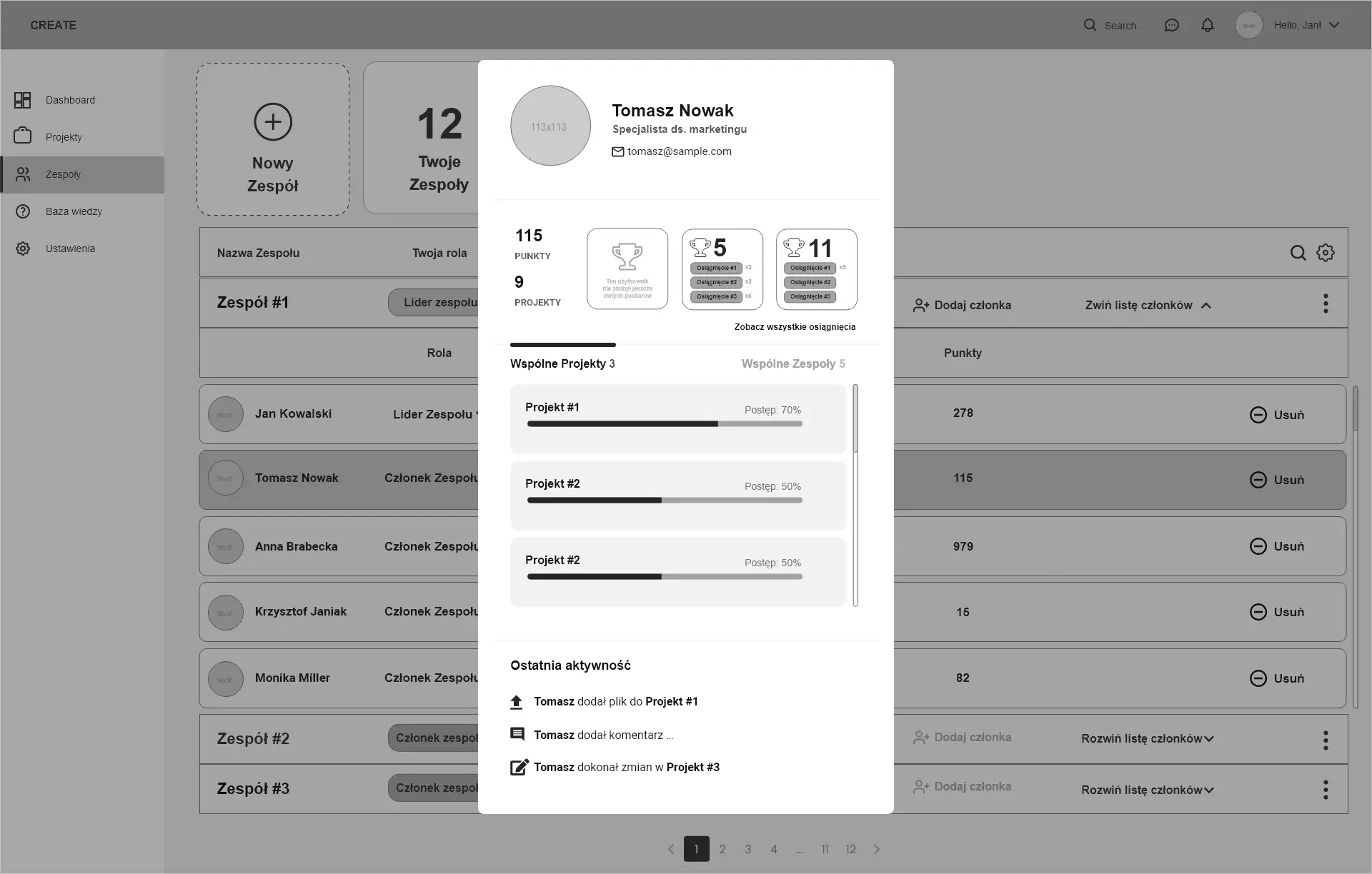
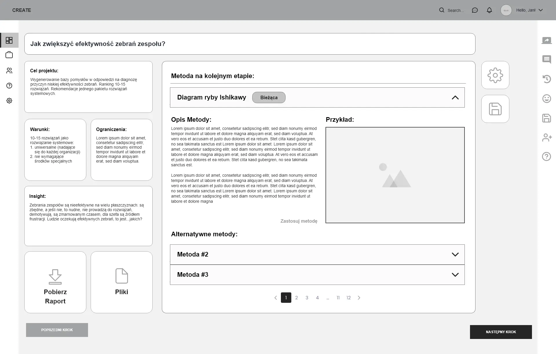
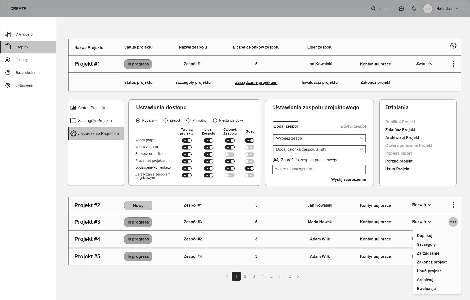
Created foundation on which the UI will be built: application map that will ensure a positive user experience, defined and planned funtionalities, created information architecture along with user journey and wireframes, both lo-fi, and after approval, hi-fi.
User Interface
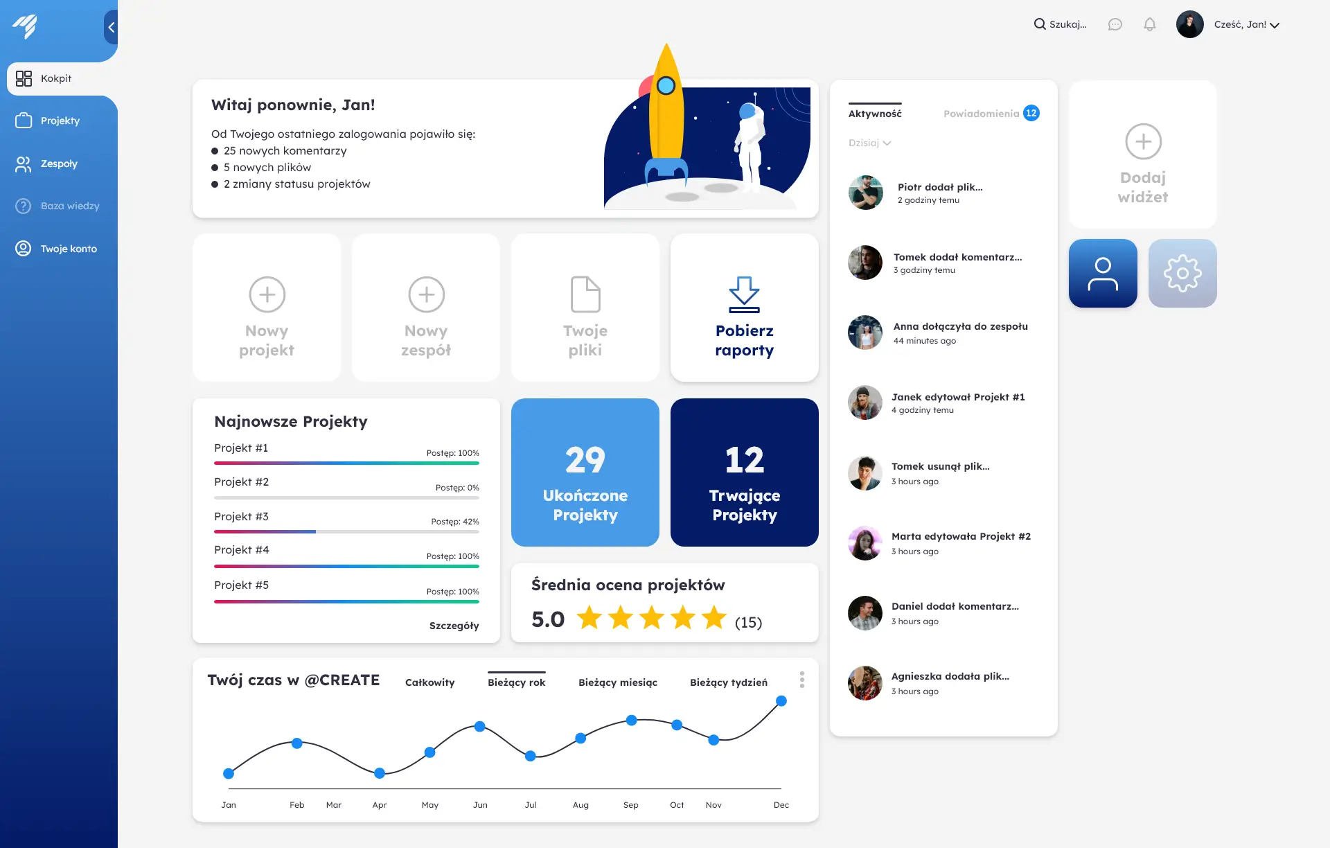
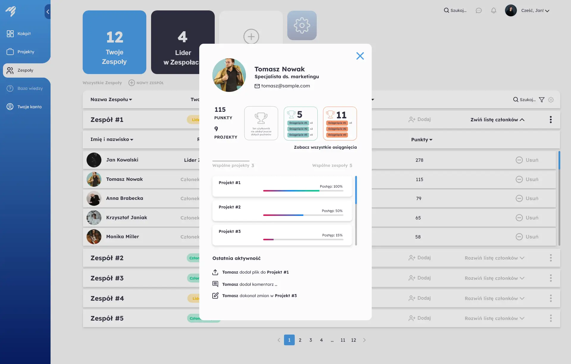
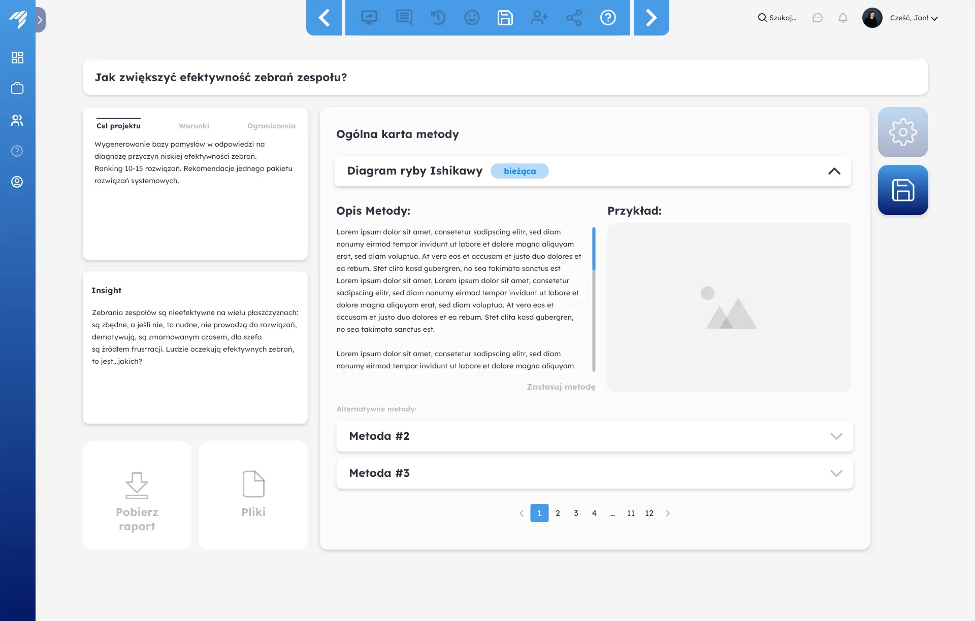
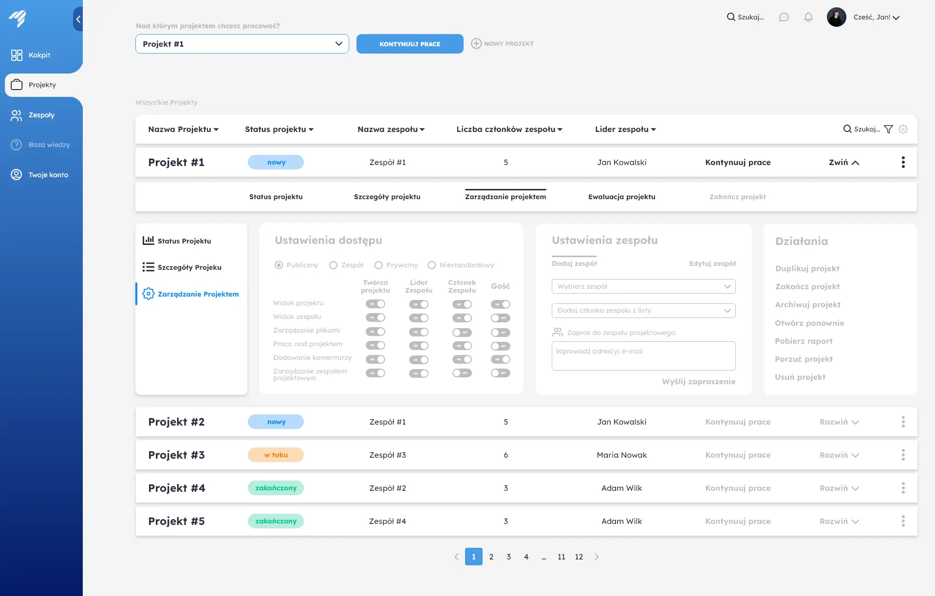
Based on the results from previous steps, created an app interface in desired file formats. This step included also testing and feedback gathering, as well as consultations regarding data visualisation that will be implemented at later stages of the project.
Assets Handoff
Cooperated closely with back-end & front-end developers after handing them over the complete set of assets, both as a prototype designed in Adobe XD and JPG hi-fi wireframes, along with graphic elements to be used as part of the app.
Empathy Map & User Profiles
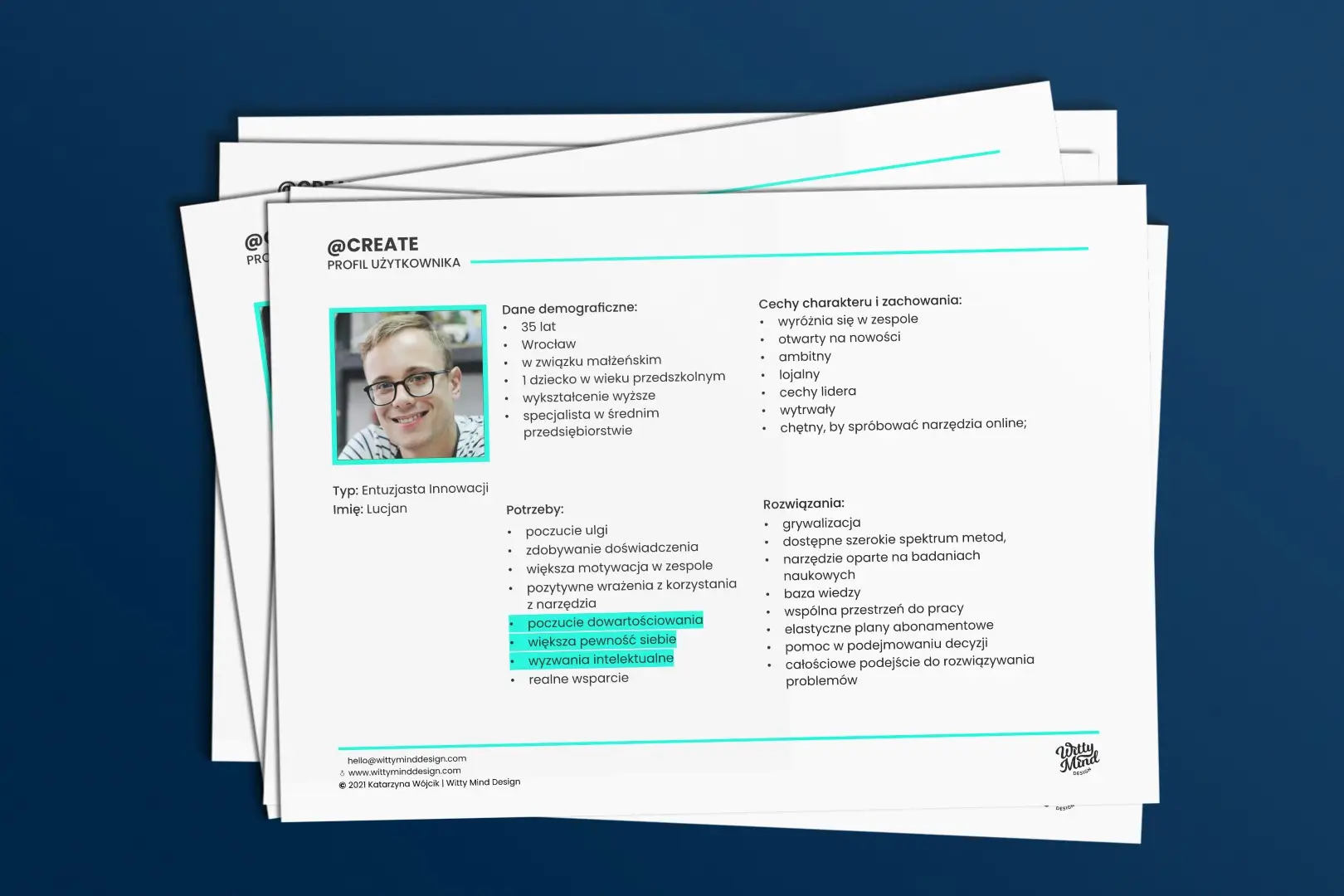
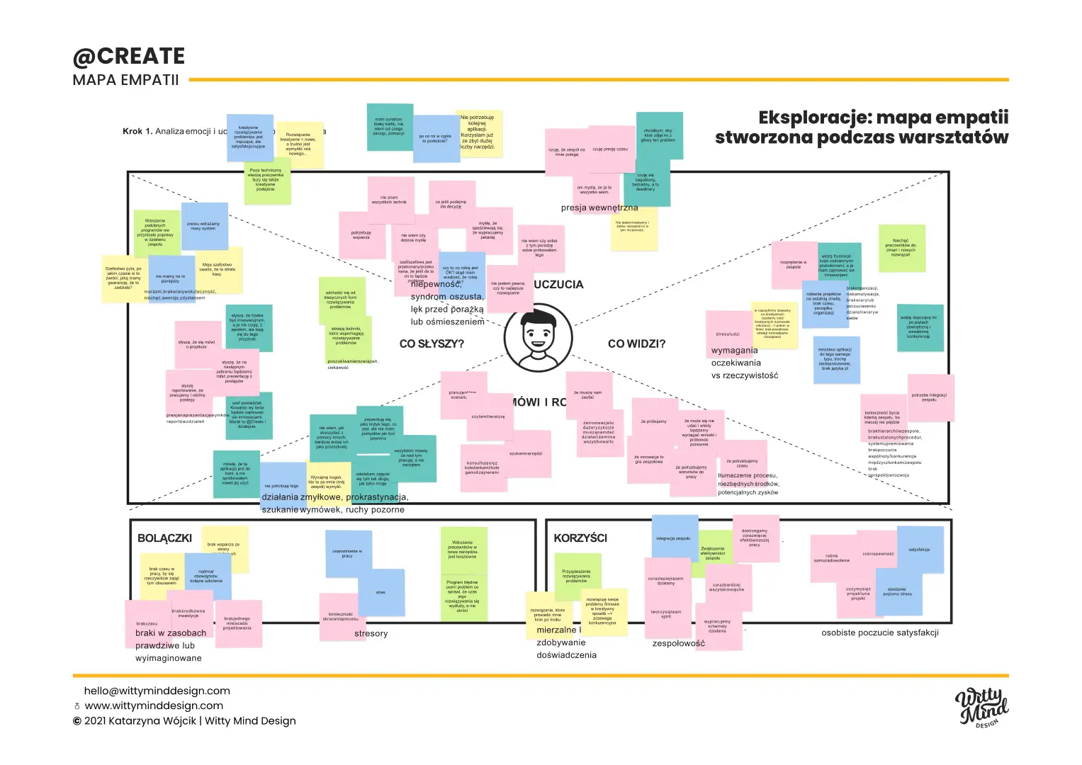
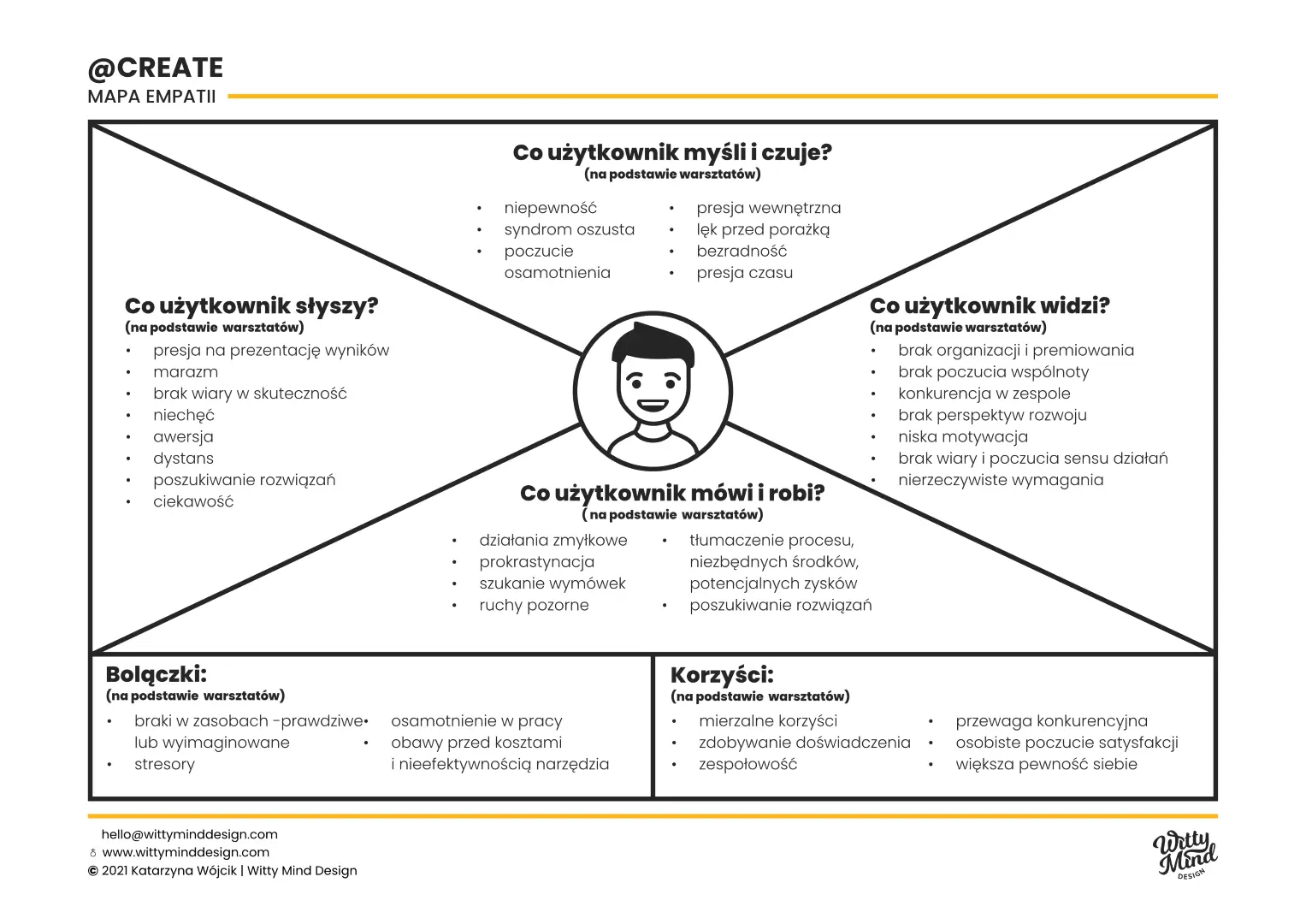
As the first step of the process, ran a series of creative workshops with the stakeholders and development team in order to define the foundation on which the application’s interface and UX will be built. We started from discussing potential user base and created empathy map along with user profiles.
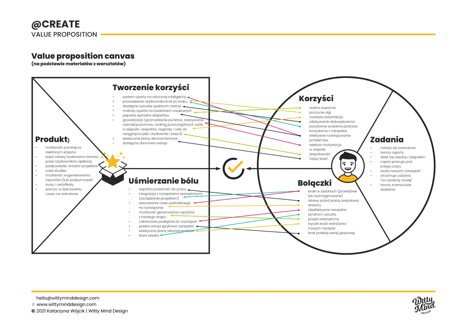
Value Proposition Canvas
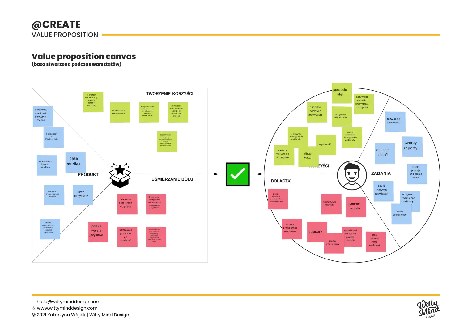
We mapped out the user needs, pains, and gains alongside the products or services’ features, benefits, and unique value propositions to gain deeper insight into how to tailor the app to effectively meet customer needs.
Value Positioning Statement
Zoddy helps people seeking support in creative problem solving and encourages them to experiment. Our Users become more confident and create truly innovative ideas.
We take on the burden of selecting methods and help our Users make decisions.
Customer journey

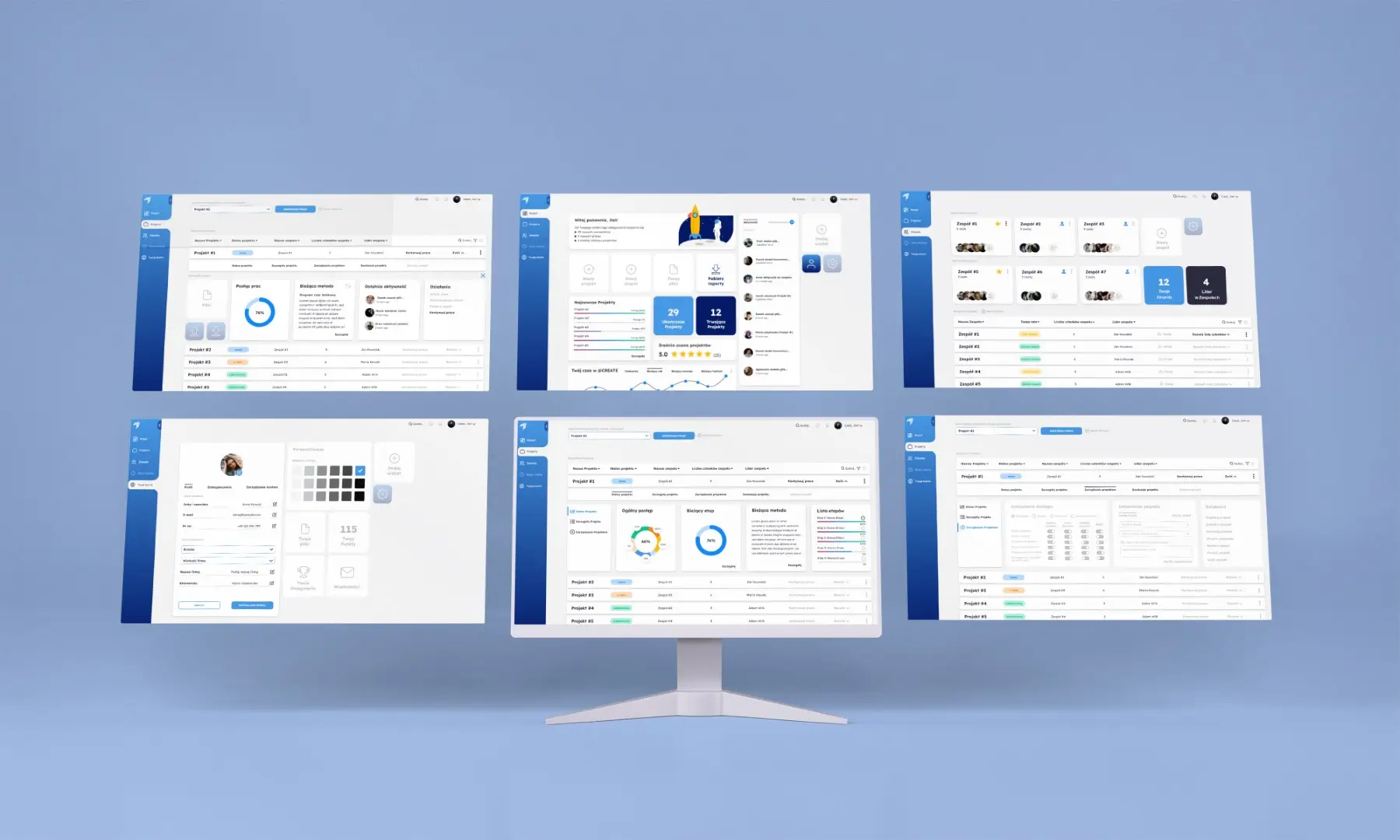
Selected wireframes
Final design
Phase II: Usability Testing
Methodology
The usability testing project involved conducting 3 rounds of non-moderated, remote tests with total of 30 users, and then a round of moderated, in-person test with 10 users. The groups were evenly split between genders. The focus was on testing the path flow according to the script, assessing users’ ability to navigate through the creative solution process for a given problem and plan its implementation.
Goals
The test goals centered around answering key questions such as whether users perceived potential in the application prototype, their ability to successfully carry out the process, identification of any encountered problems, understanding of the app’s functionality, recognition of the application’s value, and establishment of trust in the app. The findings from these tests will guide refinements to enhance user experience and ensure the application meets user needs effectively.
Business Objectives
The business objectives of the usability testing were to assess the intuitiveness and friendliness of the interface, gather insights on users’ first impressions, identify potential errors, and collect feedback to inform modifications for improving the application’s usability.
Usability Testing: results
In the remote usability tests, the application showed consistent improvement across three rounds. It began with a B rating and 74 points on the SUS scale (System Usability Scale), progressed to an A- rating with 79 points in the second round, and achieved an A rating with 82 points after the third round. In the moderated tests, the app reached an A rating with 81 points, indicating significant usability enhancements and positive user experiences throughout the testing process.
Highligths
“All steps were clear and transparent. Going through the application feels very nice. The methods used were great. A very helpful tool to solve a problem without getting frustrated with searching for the causes and how to remedy it.”
“The idea is positive – the most interesting thing: the program allows you to tackle the task top-down, allows you to extract thoughts, choose what is most important; and at the end: hey, I’m figuring this out on my own.”
“Even though it was a difficult problem, it was quite easy to come up with solutions; I wouldn’t have come up with these solutions without this flow; the cards were great – in fact, each one was inspiring.”

